BOLD is a community platform built to connect, inspire, and amplify — a space where people come together to create impact. When it came time to relaunch their visual identity, the challenge was clear: build a brand that doesn't just represent the community, but feels like it belongs to them.
Community as a Stage: The core idea behind BOLD's new identity came from thinking about what a community platform really does.
We started by taking a close look at the existing BOLD logo — analysing its structure, proportions, and character to understand what was already working and what the brand had outgrown.
From there, the brainstorm opened up. The challenge was clear: BOLD isn't one thing. It's a community platform with multiple faces — Events, Matchmaking, and Unconference — each operating as its own sub-brand under the BOLD umbrella. Any new sign and visual language would need to carry all of that without losing coherence, while still feeling like a natural evolution of what existed before.
The insight that unlocked everything: a community is a stage. It gives people a place to perform — to share, to shine, to be seen. That single idea became the conceptual spine of the whole identity.
With that direction established, we ran multiple rounds of exploration across different boards — pushing the stage metaphor in different directions, testing how the icon could flex across the sub-brands, and progressively narrowing toward a favourite selection that felt right for BOLD.

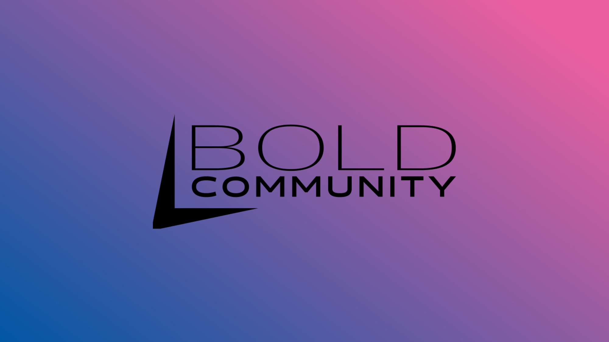
The logo mark was derived directly from a stage silhouette — the classic proscenium shape abstracted into a bold, graphic icon. A spotlight from above adds directionality and energy, turning the symbol into something that feels both iconic and alive. Simple enough to scale down to an app icon, expressive enough to anchor an entire visual system.
The typography leans into confident, unapologetic letterforms — faces that hold their own on stage. The colour palette balances bold primaries with warmer tones, giving the identity range without losing coherence. Whether it's a social post, an event banner, or a membership card, the system works.
The final brand guide brings it all together — logo usage rules, colour specifications, typographic hierarchy, tone of voice, and a set of templates ready for the community to use. It's not just a rulebook; it's a toolkit that empowers the BOLD team to communicate consistently across every touchpoint.


A brand identity that earns its name. BOLD isn't just the community's name anymore — it's a statement about how they show up. From the icon to the smallest detail in the system, the new identity gives BOLD a stage worthy of the people who stand on it.


